Last week Neo Technologies announced the general release of v2.2 of the world’s most popular graph database.
The culmination of 20+ person years of engineering effort has created what Neo Technologies call the most powerful native graph database available, apparently reporting 10-100x faster read and write performance. The advice to Neo4j customers is to upgrade to 2.2 (guidance notes here) to enjoy the new improvements.
Given Neo4j is a popular back-end to KeyLines network visualization applications; we thought we should create some guidance notes of our own. We’ve also just updated our KeyLines for Neo4j Getting Started guide.
What’s new in Neo4j 2.2?
The headline here is performance: faster write performance, better read scalability, improved Cypher efficiency.
As front-end developers, we understand the importance of a speedy back-end. We migrated our Neo4j demo in the KeyLines SDK to 2.2 and immediately noticed improved responsiveness.
The other big change is a massively improved Neo4j Browser. The latest version is packed with new functionality to help the database administrator understand and construct an effective graph model. This is a huge value add to KeyLines developers and the perfect step between the white board and building your user-facing graph visualization application.
What do I need to change in KeyLines?
The good news is on the whole, there are only two changes you need to make when you switch to Neo4j 2.2.
1. Move to the Transaction REST endpoint (if you haven’t already)
To enjoy the latest improvements, you should switch your KeyLines cypher endpoint from the legacy location (http://localhost:7474/db/data/cypher) to the new transasction-based REST endpoint (in use since v2.0 – http://localhost:7474/db/data/transaction/commit).
2. Check your authentication
Neo4j 2.2 introduced token-based authentication to access the REST APIs, enabled by default. You should decide whether you want to update your KeyLines app accordingly, or simply store your Neo4j credentials on the server (by-passing security issues).
We’ve updated our SDK demo code in line with Neo4j 2.2. Of course, the demo is just a simple example of how to connect Neo4j with KeyLines … You should make security decisions based on the configuration that makes most sense for you!
A footnote:
Whilst playing with Neo4j 2.2 this week, we were blown away by the overall quality of the database. In less than an hour, and with just a few clicks, we were able to download, install and migrate our (relatively small) dataset across.
If you haven’t already, we recommend you go have a play: http://neo4j.com/download/
Need more help?
If you have any questions about using KeyLines to visualize your Neo4j graphs, get in touch or download the new version of our KeyLines for Neo4j Getting Started guide.
The post Visualizing Neo4j 2.2 appeared first on .


 Last week, Amazon filed its


 One of the great things about


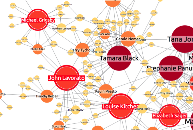
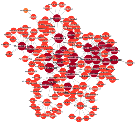
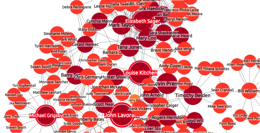
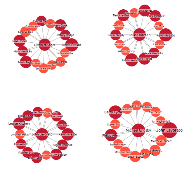
 Visualizing OrientDB
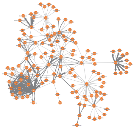
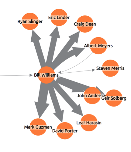
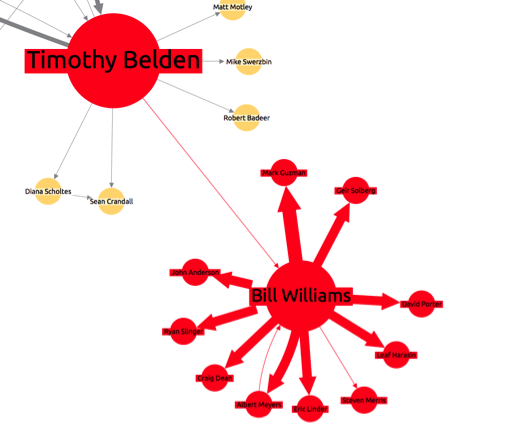
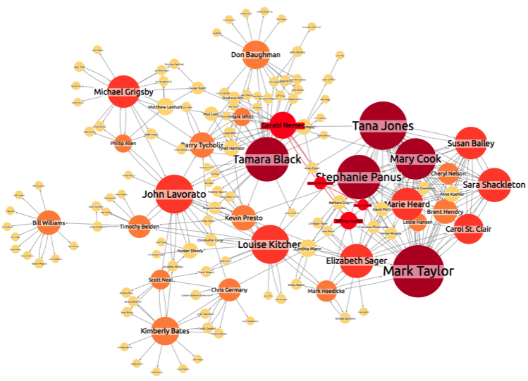
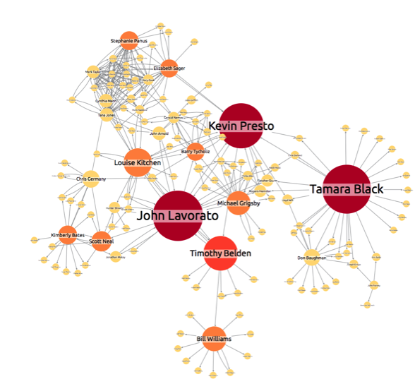
 Social connections dominate our lives. Networks of important people – politicians, business people, etc – have huge influence over the world we live in. For businesses, being able to understand these social networks of influential people can be the key to success.
 Last week, we were lucky enough to take part in the Cyber Innovation Zone at Infosec 2015. Our Product Manager, Ed Wood sums up his experience at Europe’s largest information security event.


 Why have a static force-directed layout?


 We’ve written before on this blog about the rise of the graph database.

 One of the best things about KeyLines is its customization. Every aspect of a KeyLines application can be adapted to meet the needs of your users, and the peculiarities of their data.


